
Visualizations represent a means to communicate data and analysis results. Our research at the Chair for Data Analysis and Visualization is driven by real-world problems and intends to bring the human capabilities and perception together with computer algorithms, using visualization. Thereby, we face the key challenge of how to visually communicate data to the human. A common assumption of visualization researchers is: the more abstract a representation is, the harder it is to interpret for the human, in particular if not trained in reading visualizations.
We collaborated with intelligence data analysts of English and German Law Enforcement Agencies (LEA) for the last three years. As it turned out, these analysts had no prior knowledge in data visualization or machine learning methods at all, however, are highly skilled in manual data analysis. They analyze raw tabular data on a daily basis seeking for patterns and potential suspects. Key analysis tasks include comparative analysis of offenses, where analysts consider multiple attributes, in potentially large data sets, at once.
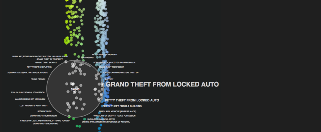
The group of analysts posed the perfect match for us in order to evaluate whether they are able or unable to interpret the visual depiction of their data. They know the data good enough based on their daily work routine, but are not used to visual interpretation. To challenge the analysts, we chose to visualize the data using Dimensionality Reduction, that is a technique known in advanced statistics, which translates multi-attribute data to a two-dimensional plane. The results are typically depicted using a standard scatterplot with x- and y-coordinates. Normally, one already learns to read a standard scatterplot in early years, right after entering school. Using Dimensionality Reduction, one needs to consider the proximities between points rather than their exact positions, and be aware of the attributes that influence the proximities; the closer points are located, the more similar they can be considered. We performed a qualitative study with three of the domain experts, meaning we confronted them with an abstract data representations using Dimensionality Reduction and different tasks in such way that we can state whether they are able or unable to interpret it.
Generally speaking, we were impressed and equally surprised by the results: Contrary to our beliefs, the group of analysts was able to interpret the very abstract visual depiction of their data given a minimal set of state-of-the-art interaction techniques. This result is of particular interest, because visualization researchers, us included, assumed the opposite. We are aware that our results are limited regarding the application and the analysts we studied, yet it is a first step towards proving that we should never underestimate domain experts. We think that there is still a lot of work to do regarding communicating visualizations and integrating domain experts in this process. We should consider collaborations with domain experts at eyelevel rather than trying to find solutions that meet our requirements but not theirs.
At this point, we again like to thank all analysts of the LEAs, without whom it would not have been possible to prove this point.
We recently presented the results of this study at the VISIGRAPP 2017 conference in Porto, Portugal. The conference consists of four tracks, one of them called Visualization Theory and Applications.
Project website: http://dominikjaeckle.com/projects/2017/crime_interpret/
Reference: Dominik Jäckle, Florian Stoffel, Sebastian Mittelstädt, Daniel Keim, Harald Reiterer.
Interpretation of Dimensionally-Reduced Crime Data: A Study with Untrained Domain Experts.
Proc. Int. Conference on Information Visualization Theory and Applications (2017). [PDF]
Co-authored by Florian Stoffel, PhD Student at the Data Analysis and Visualization Group of Prof. Daniel A. Keim, University of Konstanz.
Good morning! This may sound like an odd email/request. I’ve recently been exposed to RStudio in a graduate program at George Mason University in Virginia, USA. I am very interested in creating a data visualization code that would create abstract art based on someone’s answers to a 15 question survey (no open text boxes, just all select a value). I have no idea where to begin? any guidance is appreciated!
Diane