
Can you imagine the social connections people had at the beginning of the 20th century? They had their family and a strong connection to neighbors. Most probably friends were living in the same village or in the next town. You could have painted a bubble for each person you knew on one sheet of paper and even would have had room enough to put the name in the middle – a network easy to analyze.
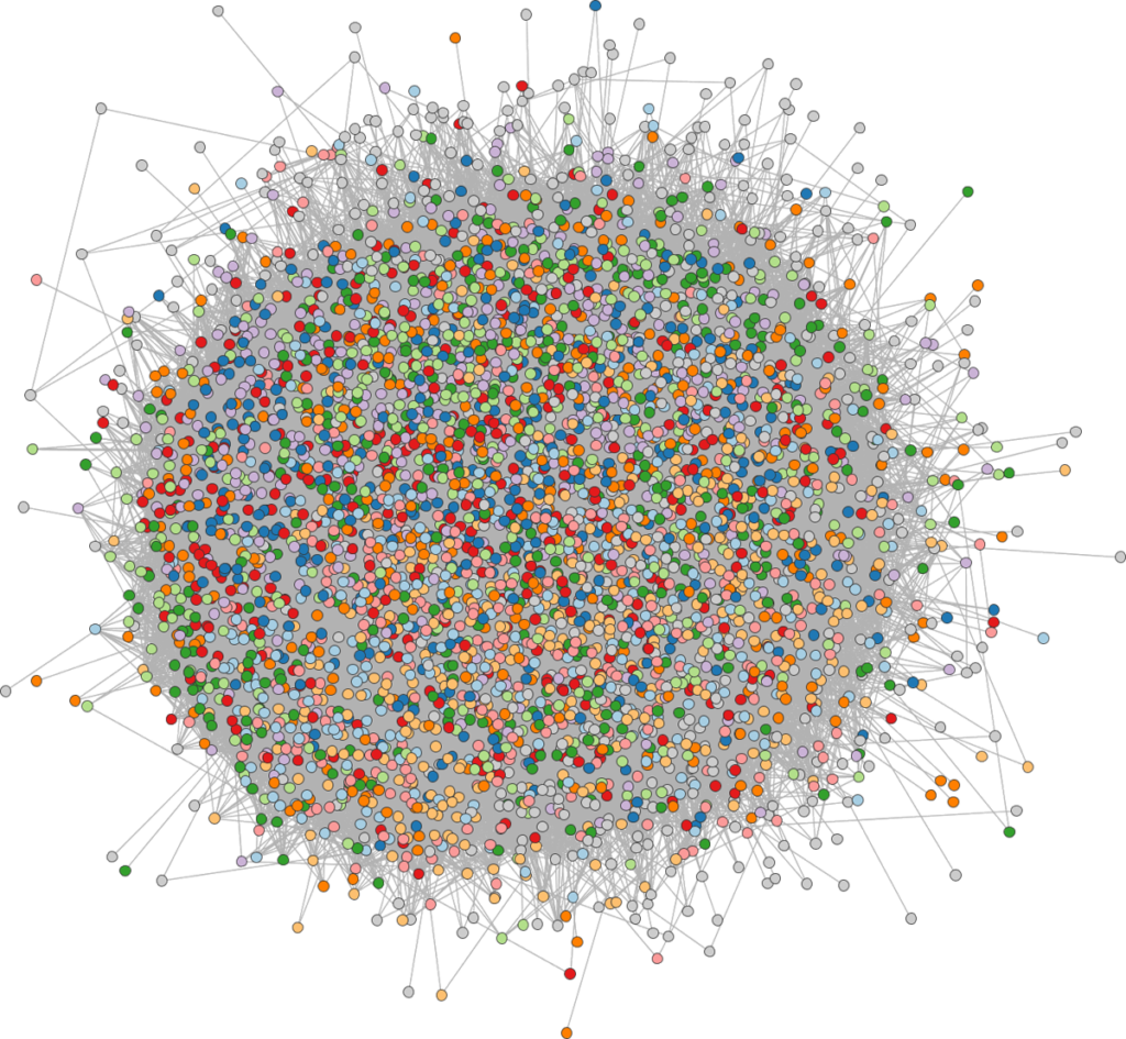
One century later we are dealing with computer networks, biological networks, or social networks, which are just some of the most popular examples. Networks allow us to model and study many real world phenomena since they are capable of representing pairwise relations between the items of interest. However, we need appropriate methods to visualize networks in order to present, explore, and understand underlying structural properties. The capabilities of some methods are often limited when a graph is too complex and exhibits specific characteristics preventing it from unfolding its power and resulting in hairball like drawings.
Arlind Nocajs doctoral thesis is about the complex task to focus on certain aspects of the network and emphasize these aspects using various visualization techniques and graph drawing methods. The general approach followed throughout the thesis is the following:
Focus on specific aspects of the network.
Depending on the application, he first decides which aspects of the network he is interested in. For example, if he is interested in analyzing the community structure in social networks, he might set the focus on local density, as he might expect community members to be highly connected among each other. In Part I of his thesis he proposes various approaches by using hierarchical abstraction. In Part II the local density is the focus of interest. He uses methods of filtering to give insights in different aspects of a graph.
Emphasize these network aspects in a visual representation.
Based on the foci of interest, the aspects are emphasized using different layout methods and visualization techniques.
Improve the visual readability.
In this final phase, methods for improving the readability of network visualizations in general are developed. Here small changes can result in better readability without destroying the overall layout or visual representation. For example, nodes are slightly shifted to remove the overlap between their labels.
Arlind Nocaj did his research at the University of Konstanz. You can follow his approaches in detail in his dissertation “Untangling Networks : Focus on Less to See More”.
Visualize your own Facebook Network
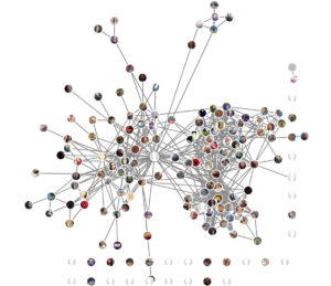
Apart from reading you can as well try out some of his ideas in the chrome extension Lost Circles to visualize your personal Facebook network!
Your Facebook network of maybe a hundred friends or more may also be an example of a dense graph. This is because your friends are usually friends with each other, resulting in a huge number of links. The app untangles your network and shows the hidden group structure among your friends – your lost circles. This is done by determining the relative importance of the links and draw your friends with stronger ties closer together.
Try it out for yourself!
Text and images supported by Arlind Nocaj.